The task
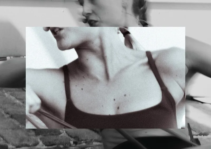
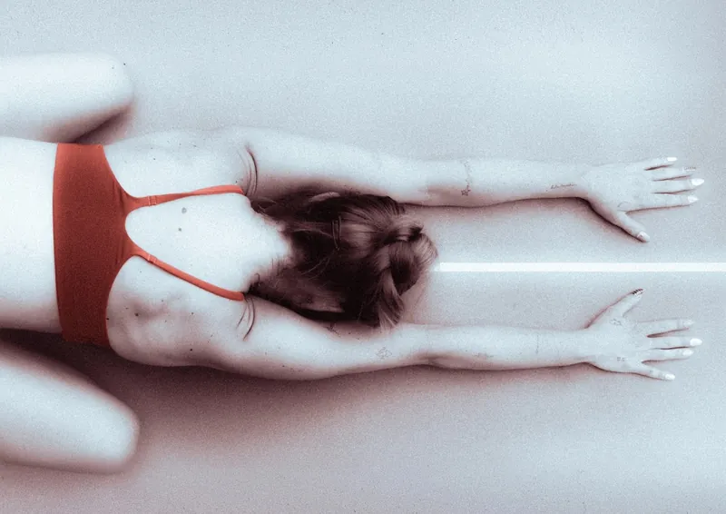
I lost 30 kilos, and sport changed the way I live. For a university project, I turned that into a magazine: a photo series about movement, photographed and designed entirely by me.
Idea & approach
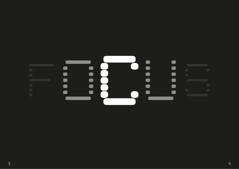
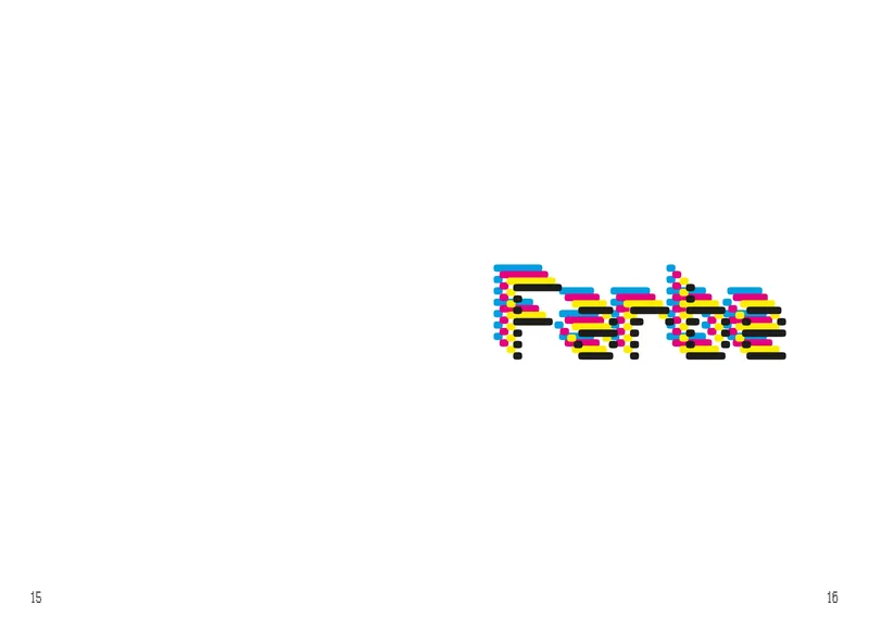
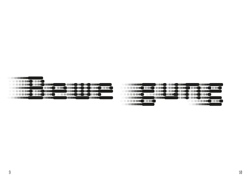
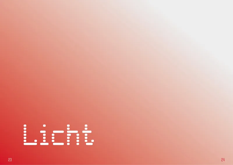
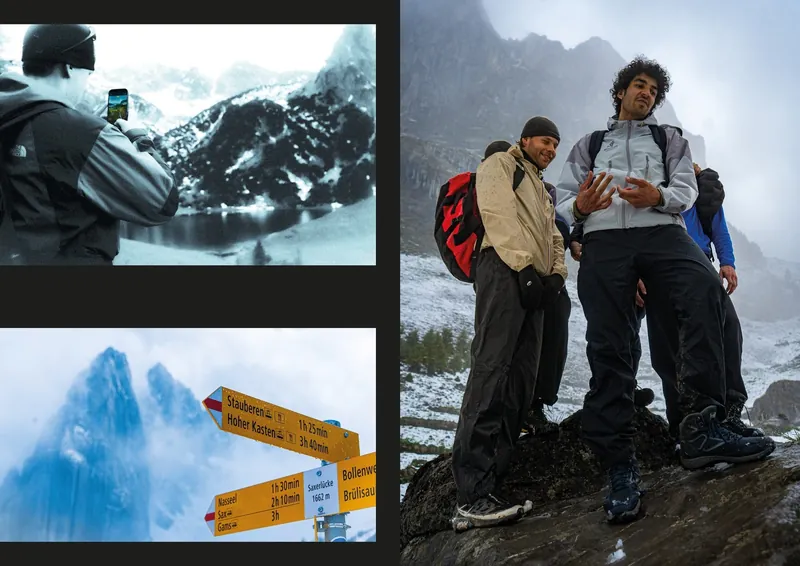
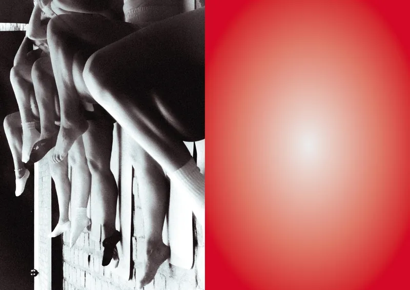
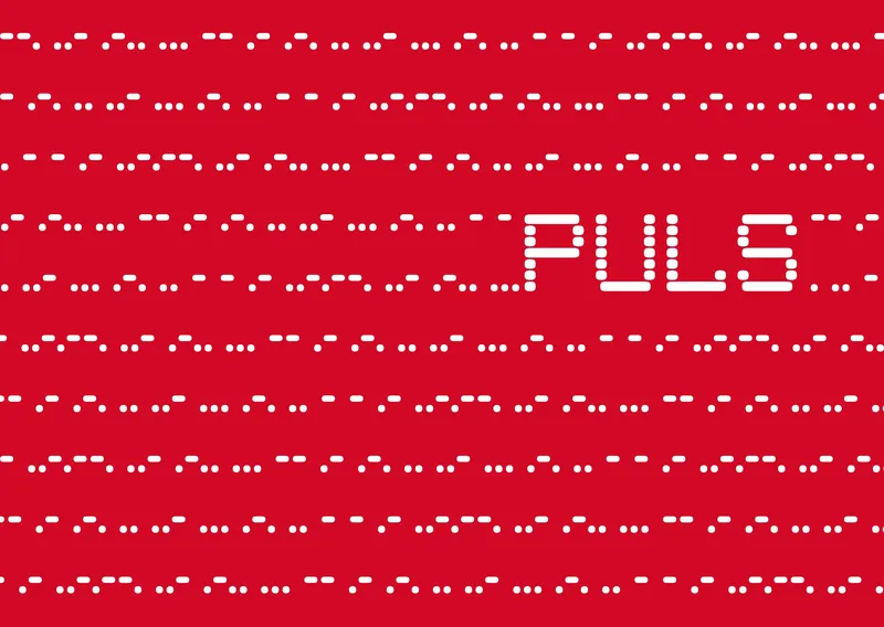
The magazine is built around four photographic chapters: Focus, Colour, Movement and Light. It follows two very different kinds of sport: demanding hikes in the Alps, and Pilates as a calm counterpoint of slow, controlled movement. The cover carries the idea: a Morse code pattern that spells "PULS Marius Rittau" over and over, like a heartbeat. I chose a variable typeface whose shapes echo dots and dashes, and adjusted it specifically for the magazine.
Process
The challenge was holding four very different chapters together. Each chapter opener is designed around its own theme, while grid and type keep the magazine consistent. Already while shooting, I had to choose subjects and moments that would carry one of the four themes.
Result & learning
PULS taught me how to make photography personal: to tell my own story, then translate it into a clear editorial structure. And it showed me that good design starts behind the camera, with choosing the right subject and capturing the right moment.