The task
Citycards fills racks in bars and cafés with free postcards, most of them advertising. The brief came directly from them: postcards about Cologne that make people stop and look, not just walk past. We developed typographic and motif cards and presented three to the client.
Idea & approach
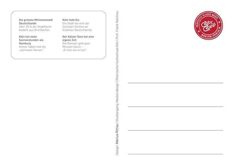
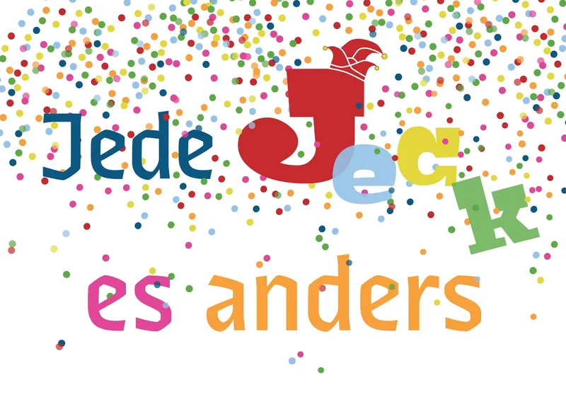
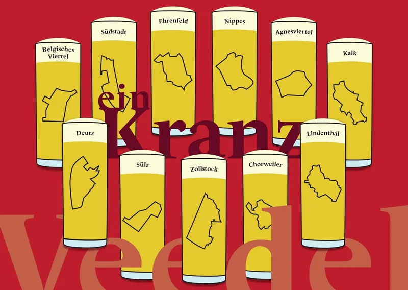
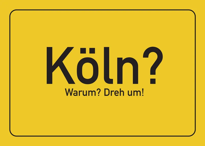
Since everything was about Cologne, I set the cards in typefaces from Floodfonts, a Cologne type foundry. "Köln? Warum? Dreh um!" is styled like a town sign in FF DIN and is meant to provoke locals a little ("Cologne? Why? Turn over!"), and the back answers with fun facts about the city. "Jede Jeck es anders" plays with the Cologne saying that everyone is crazy in their own way, so every word is set in a different Floodfonts typeface. "Kranz Veedel" shows a Kranz, the ring tray of Kölsch glasses: eleven glasses, each carrying the outline of a different Cologne neighbourhood that I drew in Illustrator.
Process
Postcards come with strict rules for format, address field and stamp area. Designing within those standards, then seeing how the colours actually came out in print, was a lesson in itself.
Result & learning
I learned how to work creatively inside fixed DIN standards, and how differently colours behave on screen and on paper.